

Legacy vs. StarSteer 27: What's changed
Written by:
Same Tools. New Look.
If you've used StarSteer for any length of time, you already know your workflow. StarSteer 27 doesn't erase your muscle memory. Every tool you rely on is still there, just arranged in a way that gets you to it faster and gives you more room to work. Here's a walkthrough of what's different, and why it matters. Watch the video here or scroll to the bottom of this page.
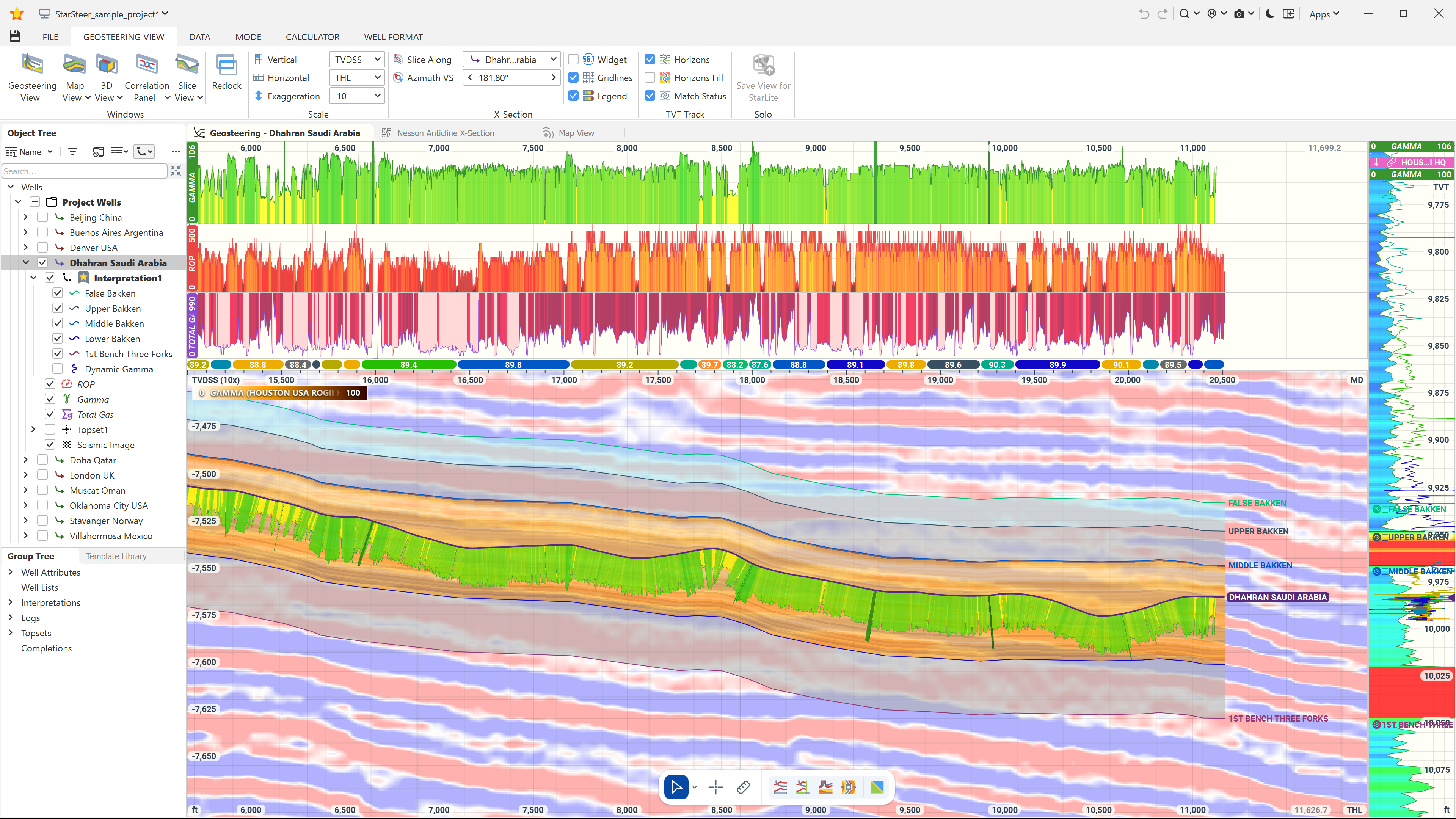
The Group Tree and Object Tree stay put
Both trees are exactly where you left them. What's different: parent objects are now sticky, so when a parent is expanded its name stays up top. No more losing your place while scrolling.
The bottom toolbar is the big one
In legacy StarSteer, modes lived behind tabs and cursor tools sat along the top of the screen. Unless you had the hot-keys memorized, that meant a lot of tab-switching and bouncing around the screen.
The bottom toolbar fixes that. It shows the modes relevant to whatever window you're in, and the editing tools next to it are specific to the view, mode, and object you're working with. Nothing generic, nothing you have to hunt for.
One detail worth knowing: the lasso tool isn't a separate icon anymore. It's built into the pointer. Click and drag with the pointer to lasso wells.
The 3D View stopped being an afterthought
Legacy 3D View navigation was clunky, and it left out details you needed. No well labels. No contour lines. Nothing giving you spatial context to make real decisions.
StarSteer 27 adds all of it: wells are labeled, contour lines are visible, and you can display horizons, topsets, and polygons directly in the view. You can also now open and save multiple 3D views, so you're not redoing a view everytime you change pads.
More pixel real estate
The old layout wasted space you didn't get back. Scale bars sat in a grey border. The status bar was static across the bottom whether you needed it or not. And if you wanted more horizontal room, your only option was moving the trees to a separate screen entirely.
StarSteer 27 insets the scale bars directly into the windows. Status bar values now live in the Quick Look table that only shows up on hover. And if you want to claim even more space, hide the trees with a single click in the top toolbar, no second screen required.
Same StarSteer, enhanced experience
None of this changes what StarSteer does. The full walkthrough is in the video below; if you want to see any of these changes in action before you upgrade, that's the fastest way.
Watch the video:
Questions or feedback? Drop us a line at support@rogii.com, or call us here.


